When I joined Competera, the product was functional — but increasingly difficult to work with and scale.
Over time, features had been added quickly to meet client needs, but without a consistent system behind them. As a result, the interface became fragmented: similar actions behaved differently, visual patterns were inconsistent, and core workflows required unnecessary effort to understand.
This wasn't just a design issue — it directly impacted usability, onboarding, and the ability to introduce new features without adding more confusion.
I conducted a full audit across both products, combining interface analysis with user feedback and interviews. The patterns were consistent:
UI before → after the redesign of Competitive data product
At the same time, as a B2B platform, the product had to support diverse client needs — including custom features requested by enterprise customers. The challenge was not only to introduce new functionality, but to make it scalable, understandable, and usable across different contexts.
It became clear that continuing to add features without addressing the foundation would only increase complexity.
The focus shifted from isolated fixes to establishing a structured approach to product evolution. Discovery, system design, and delivery were treated as interconnected, ongoing streams — enabling consistent improvements alongside feature development.
I approached discovery as part of product strategy — helping the team understand where user value, business priorities, and technical effort intersected.
This work was continuous and closely connected to delivery — informing priorities, validating decisions, and shaping what we built next.
The goal was to reduce dependency on design in day-to-day implementation. With one designer covering two products, it was critical to enable engineers to handle standard UI changes independently.
Instead of building a design system from scratch, I refined and restructured what already existed.
Worked closely with PMs and engineering leads to plan and sequence product changes across two enterprise platforms — balancing system improvements, IA restructuring, and feature delivery without disrupting existing client workflows.
A key constraint was to introduce changes gradually — improving the experience without disrupting existing user habits.
As the product evolved, inconsistent interaction patterns and fragmented workflows started creating friction in pricing operations and increasing the cognitive load on enterprise users.
The focus was to make complex pricing workflows easier to understand and faster to execute.
High-impact functionality shaped through research, system thinking, and iteration.
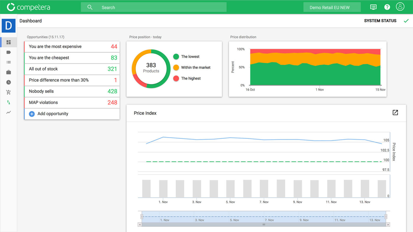
Navigation was built around internal product logic rather than user workflows, making it difficult for users to understand system structure and complete routine tasks efficiently. This led to frequent orientation questions from both clients and internal price architects.
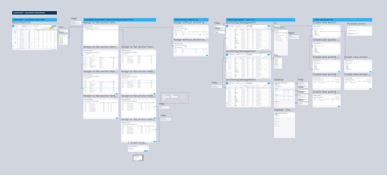
Shifted from local navigation fixes to a full information architecture redesign across both products, aligning structure with user workflows and decision-making patterns.
The changes were introduced gradually to avoid disrupting existing workflows. Enterprise clients were able to adapt without friction, while still clearly noticing the improvements in structure and usability.
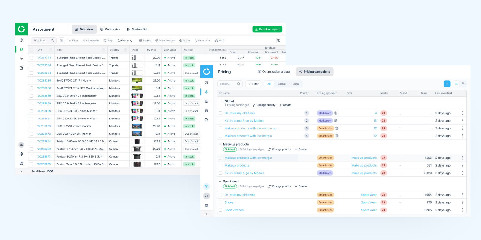
For pricing managers working across multiple campaigns with similar setups, the product required repetitive manual configuration with no clear way to reuse settings or separate drafts from live data, leading to inefficiency, inconsistency, and higher risk in pricing workflows.
The feature had to work on two levels: both as a standalone template system and as part of existing workflows. Users needed to always understand whether they were editing a template or live data — especially in a system where mistakes directly affect pricing.
We initially designed a complex version covering multiple use cases and edge scenarios. User interviews showed it was too heavy — users hesitated to use it and were unsure how it fit into their workflow.
We simplified the first release to a core version:
This made the feature easier to adopt without requiring users to rethink how they work. From there, we expanded functionality gradually — based on real usage patterns and feedback, adding complexity only where it brought clear value.
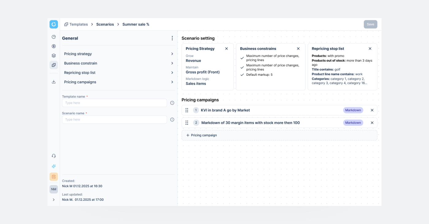
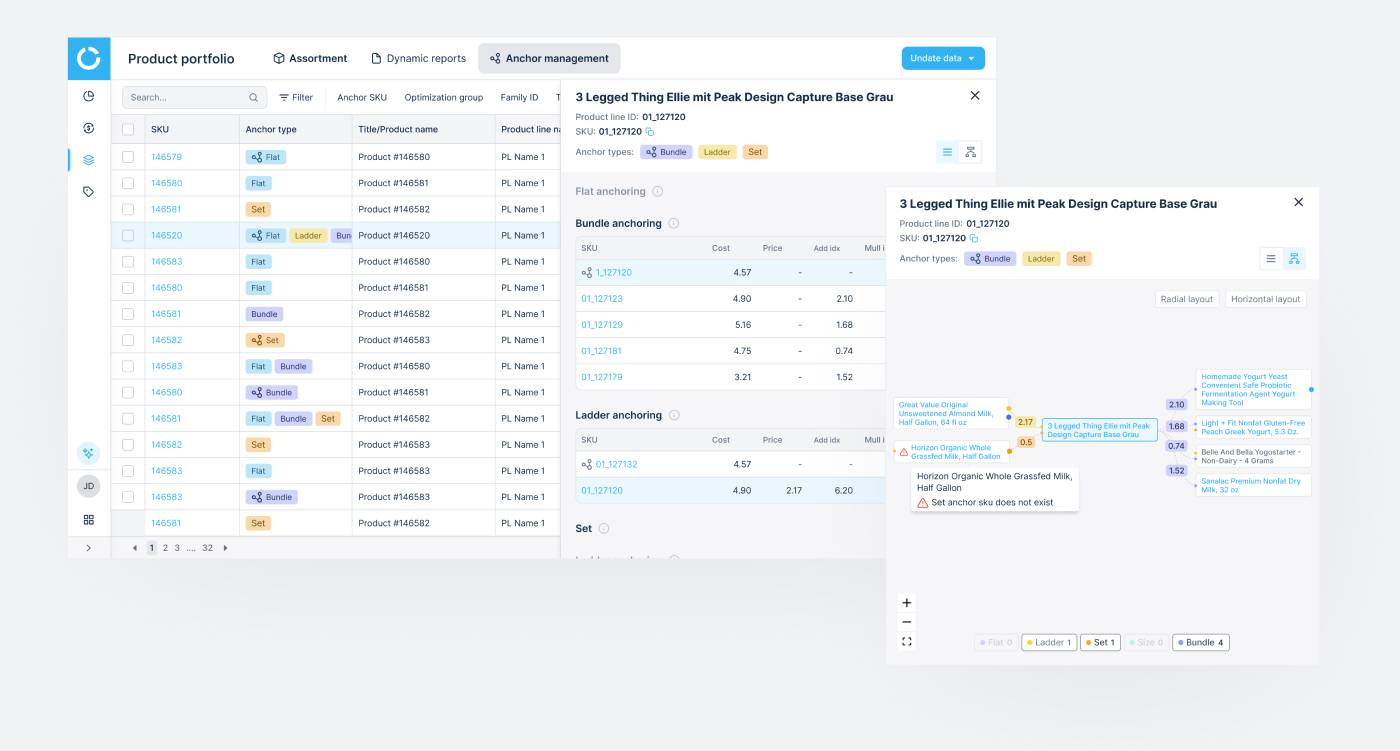
Enterprise clients needed the same capability — but each described it through different pricing logic and levels of complexity. The existing solution was limited to a table-based setup with file uploads, without a clear or scalable grouping logic. Expanding it required introducing new functionality — while keeping the system understandable and consistent across clients.
The idea was to create a unified system that supports different pricing approaches — while remaining clear, structured, and predictable for all clients. In addition to the table-based interface, introduce a node-based visualization to help users better understand relationships between products and groups — especially in complex scenarios.
The focus was to balance flexibility with clarity — enabling complex setups without increasing cognitive load.
Following validation, a set of high-priority improvements was identified to support more complex enterprise workflows. These were moved into the next iteration, focusing on scalability, bulk operations, and system flexibility.
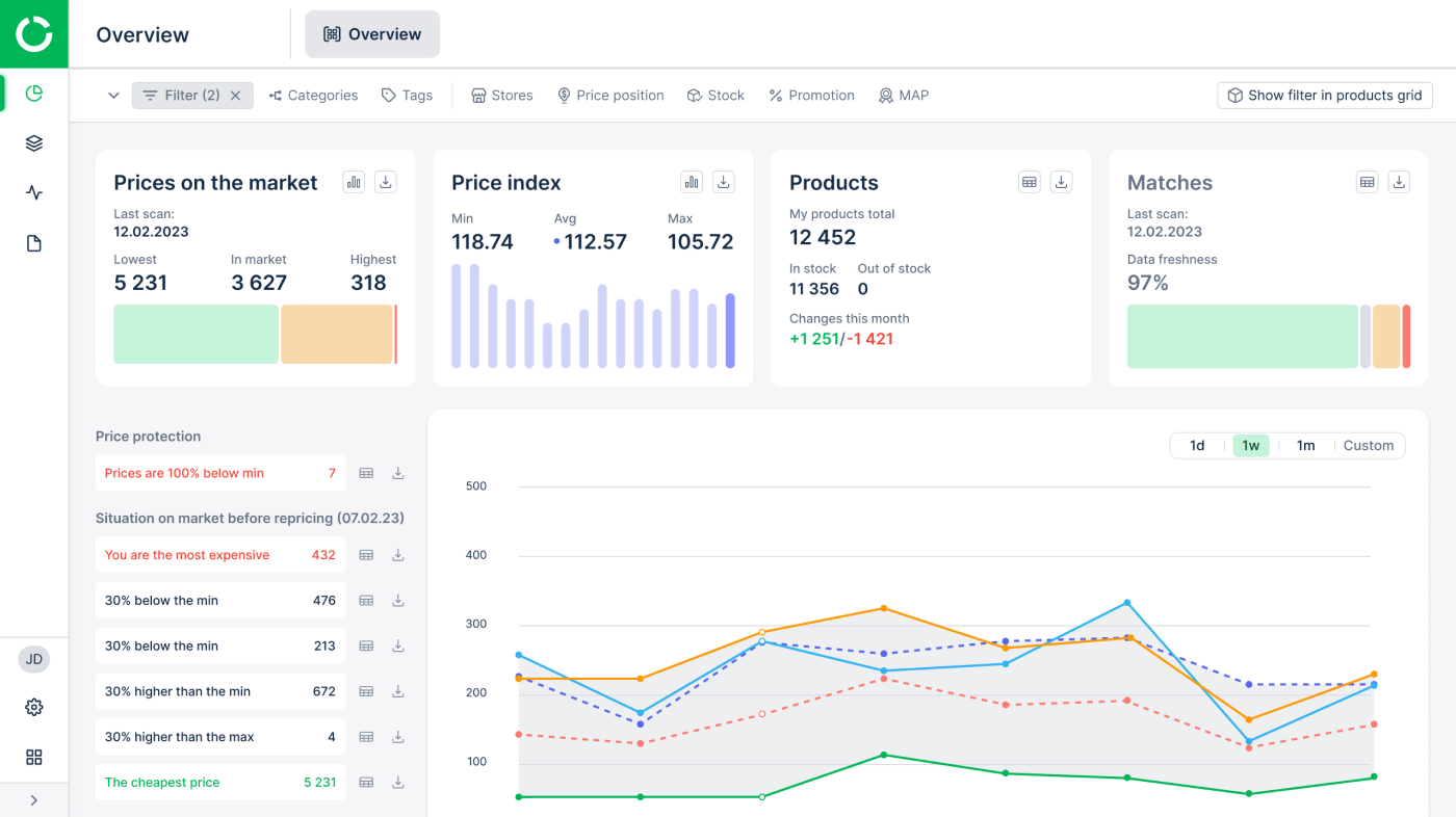
The platform contained large volumes of data and insights that were valuable for clients — but difficult to access and navigate. Not every user knew where to find the right data, or how to interpret it in the context of their daily work.
An AI assistant allowed us to surface this information on demand — answering questions of varying complexity and making existing data more accessible without adding more UI layers.
The core challenge was about discoverability. With a simple chat interface, users didn't always know:
This limited adoption, even when the underlying capability was strong.
Users needed guidance, not just answers. Without clear entry points or contextual cues, a generic chat interface wasn't enough to communicate the assistant's value.
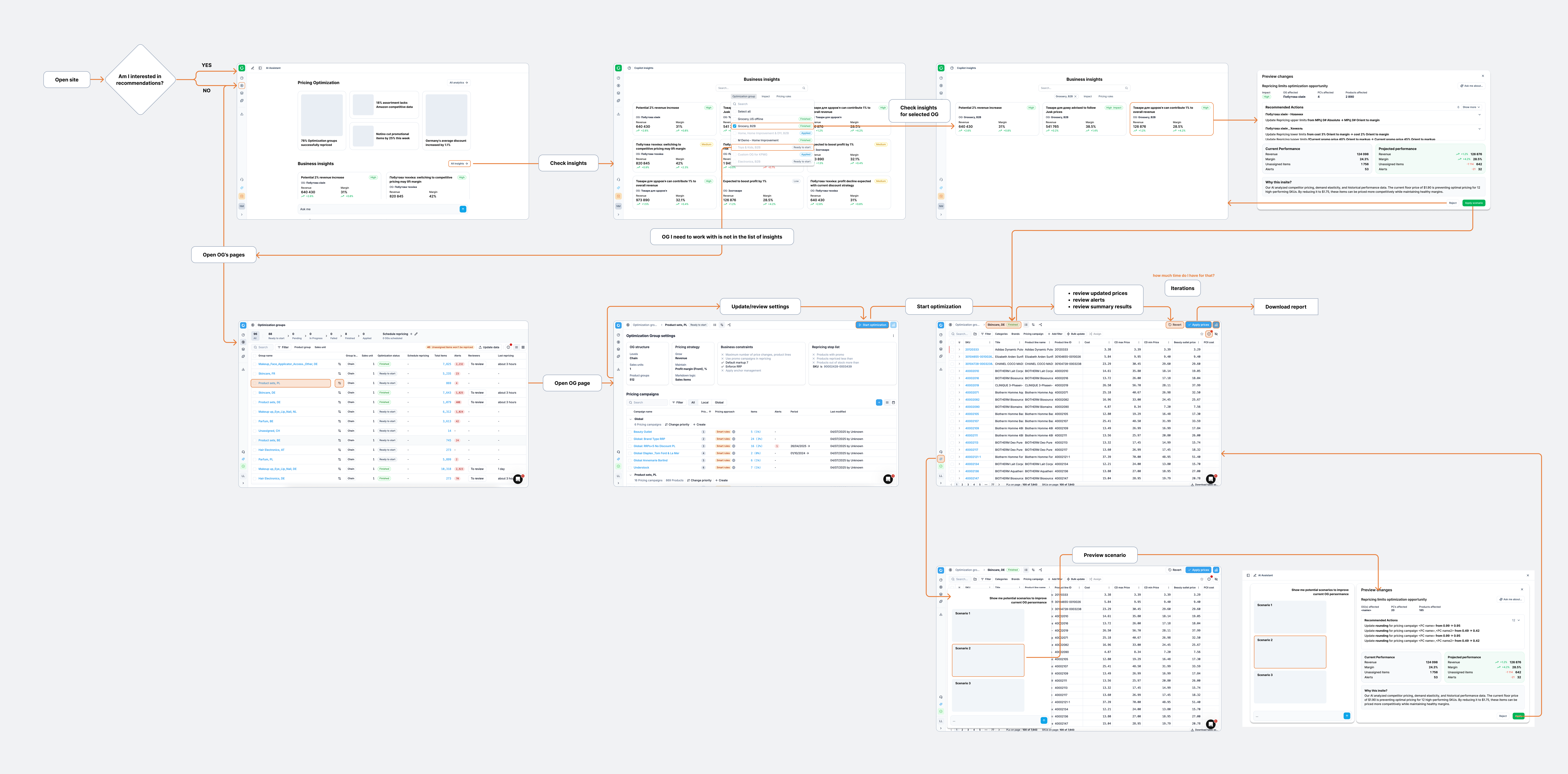
The next step was to move from a standalone assistant to a contextual one. The assistant was planned to be integrated across product sections — providing:
Beyond designing the AI feature itself, I used AI as part of my day-to-day workflow across the project:
AI handled the boring half of design so I could spend more time on the judgment calls that actually shaped the product.
I introduced a new delivery workflow for the core team — bringing engineering into the problem stage rather than the solution stage. Defined who joins when, who owns what, and how design, PM, and engineering align before any UI work begins. The result: fewer late reworks, shared ownership of solutions, and engineers contributing as co-designers on complex features rather than executors at the end.
As the product scaled, delivery issues were no longer just about design quality, but about how decisions were made across teams. Engineering was often involved too late, leading to missed constraints, rework, and delays.
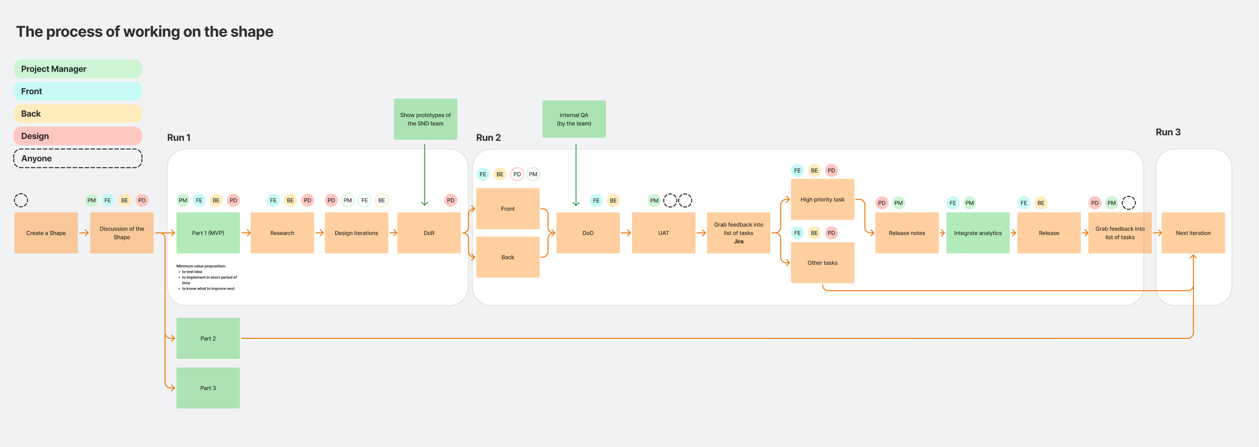
I shifted the process toward early, cross-functional collaboration — bringing rough ideas to engineers at the problem stage, before any design decisions. This reframed discussions from "how to build it" to "what should we build given real constraints," allowing solutions to be shaped jointly from the start.
To support this, I introduced a simple collaboration structure — who joins when, and who owns what — reducing ambiguity and making the process more predictable. Engineers became active contributors rather than executors, while the design system enabled them to handle routine UI work independently, removing design bottlenecks.
Push back harder on big-bang IA delivery. The full architecture redesign shipped as one two-month release. The system was too deeply nested for that to be safe — a layer-by-layer rollout, with user validation between each level, would have caught structural issues earlier and reduced rework after launch. Worth fighting for next time, even when the timeline pressures otherwise.
Push for clearer measurement earlier. I relied on engineering team feedback for the ~2× delivery speed estimate. With more upfront alignment, we could've tracked design ticket cycle time before/after the system rebuild — making the impact more defensible to leadership.
Validate the AI assistant's "blank chat" problem sooner. I built the first version assuming users would explore. They didn't. Earlier prompt-pattern testing would've saved a full design cycle.