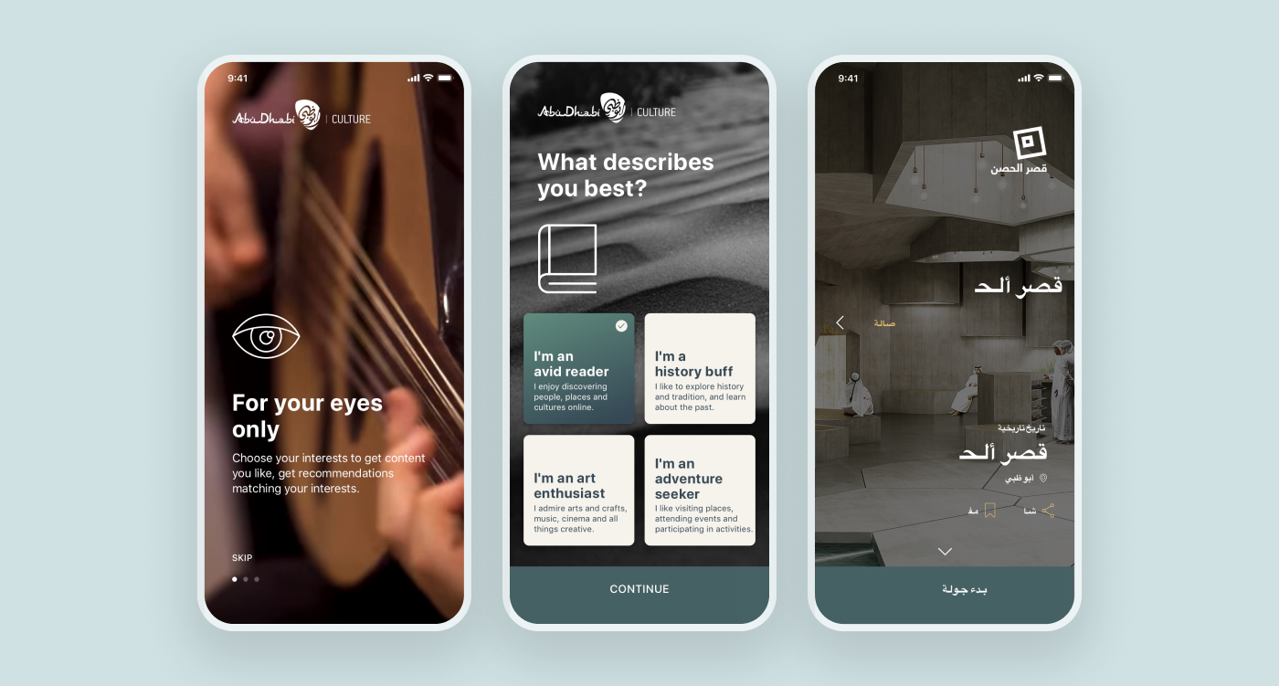
The client didn't want another generic travel app. The goal was to build something that genuinely reflected the culture of Arab countries — visually, structurally, and in how content was presented.
That came with real constraints. Arabic readers expect right-to-left layouts, distinct typographic behavior, and visual patterns that don't always translate from Western design conventions. At the same time, the app had to feel modern, intuitive, and recognizable to a global audience reading in English.
The work wasn't about translating an existing design into Arabic. It was about designing the product so it worked equally well in both directions — without one feeling like an afterthought of the other.
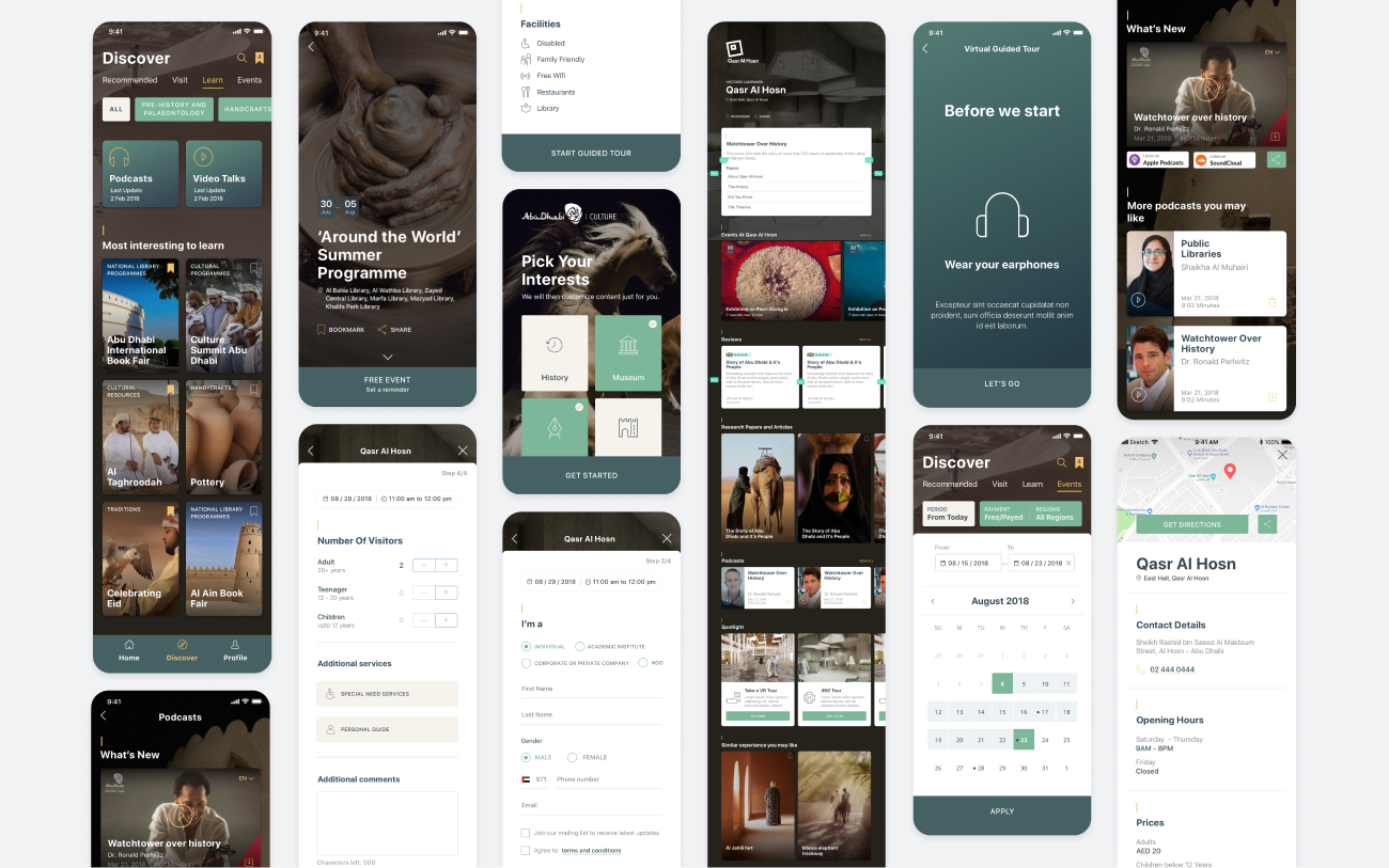
The app combined multiple content types: stories, audio, video, and location-based experiences. With that much variety, structure became the most important early decision — get it wrong, and the product would feel like a content dump no matter how good the visuals were.
Together with the lead designer, I worked on:
The IA had to support both narrative content (stories, audio guides) and exploratory content (locations, maps) — without forcing users to switch mental models between them.
A clear, scalable content structure that worked across stories, audio, video, and location-based features — and read naturally in both Arabic and English.
I owned the visual direction and brand for the app — defining how the product would look, feel, and behave across every surface.
The visual language balanced two requirements: cultural authenticity (so the app felt at home with Arabic-speaking users) and modern UX patterns (so it felt familiar and easy regardless of the user's reading direction). I explored typography, color, iconography, and content presentation styles before locking in a system that worked for both audiences.
A distinct, culturally grounded visual identity that anchored the product across languages and platforms — the foundation everything else was built on top of.
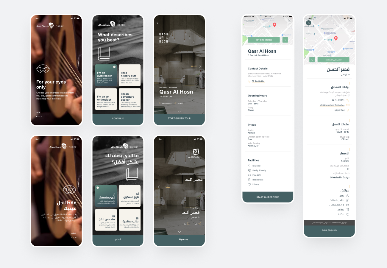
This wasn't a Western app translated into Arabic. The product was designed to work natively in both directions from day one.
That meant designing for:
A product that read naturally for Arabic users and English users alike — without compromise to either. One of several RTL projects across my career.
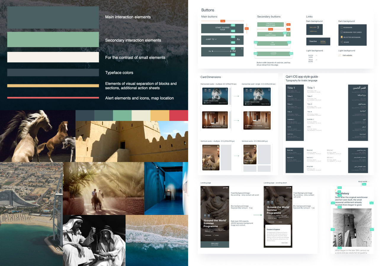
With two designers, two platforms, and two languages running in parallel, consistency would have collapsed without a strong foundation.
I built a unified component library, typography scale, and spacing system — and owned the developer documentation in Sketch, making implementation predictable across the team.
A design system that allowed engineering to ship without constant designer-engineer back-and-forth, even with the complexity of two languages and two platforms.
I worked closely with the lead designer and presented concepts and design decisions directly to the client throughout the project — including visual direction, interaction ideas, and iterations across the project.
The product launched to the App Store in both Arabic and English, on iOS and iPad.
A shipped, culturally grounded travel app — and one of the foundational RTL projects I still draw on years later.