The product was already live and serving users — but behind the scenes, it was a mess. A multilingual learning platform built across mobile, web, and an LMS, with no design system, no shared component library, and no clear logic behind how decisions had been made over time.
I joined as the sole designer with one goal: turn three loosely connected products into something the team could actually build on.
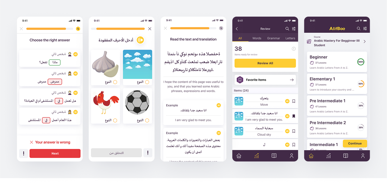
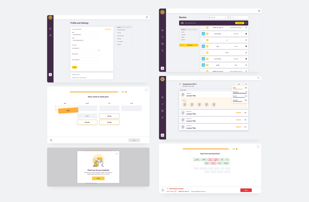
Mobile screens: before → after
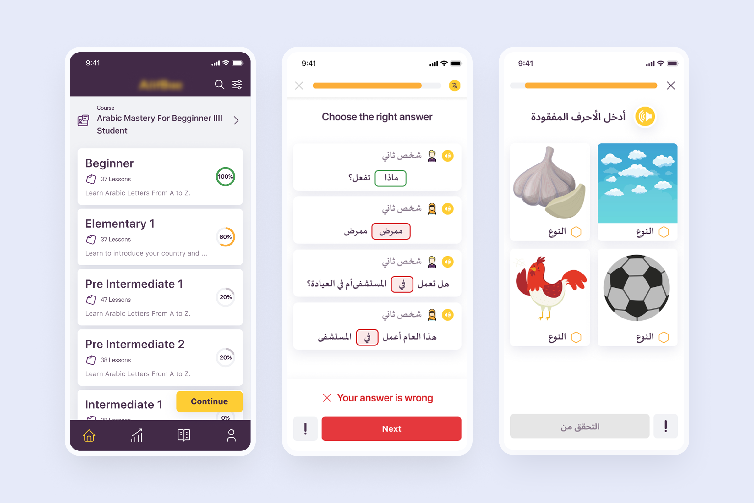
Before designing anything new, I needed to understand what existed. The product had three platforms, but design decisions were inconsistent and often duplicated — similar components behaved differently across screens, and there was no shared layout logic.
I ran a structured audit across all three platforms — reviewing flows, key user scenarios, and component usage. Pairing it with how users actually moved through the product surfaced the places where inconsistency was breaking the experience.
A clear map of what existed, what conflicted, and what needed to be unified — the foundation for every decision that followed.
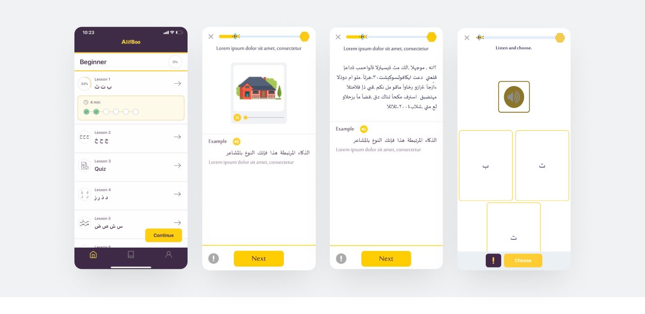
Instead of redesigning everything from scratch, I focused on organizing and unifying what already existed — keeping what worked and rebuilding what didn't.
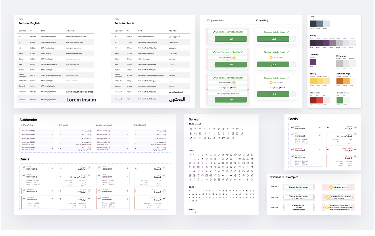
I built a design system that:
Arabic needed special attention — not just for RTL direction, but for font behavior, spacing, and readability across different dialects, each with its own typographic quirks.
To make the system usable in practice, I wrote simple, practical developer documentation — focused on clarity over completeness, so engineers could actually pull from it in day-to-day work rather than treating it as reference material that lived somewhere and was never opened.
A unified system across three platforms and two reading directions — and documentation that engineering actually used, not bookmarked and ignored.
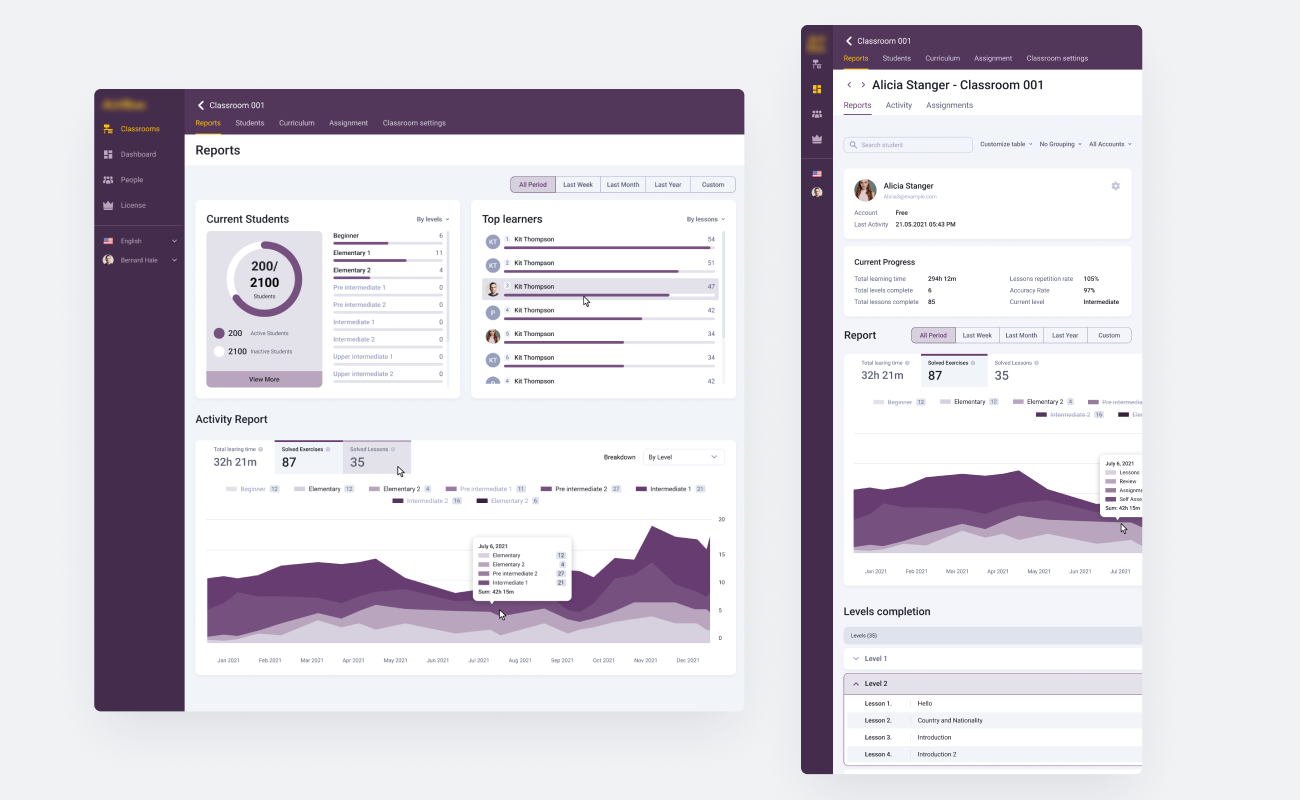
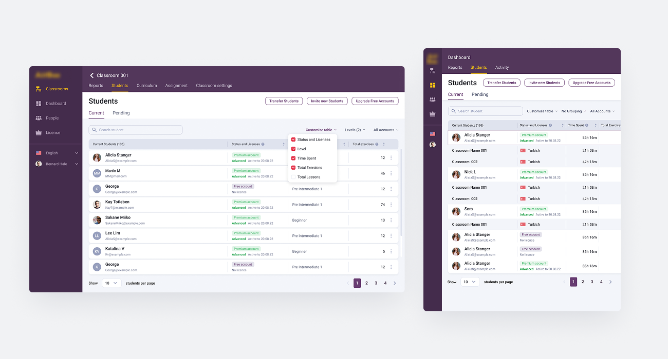
As part of the product expansion, the team introduced an LMS for teachers — a different surface from the learning app itself.
Unlike the consumer-facing learning experience, the LMS dealt with large volumes of structured data: student progress, classes, course management, performance tracking. The visual and structural problems were entirely different — readability under data density rather than engagement and content discovery.
I designed the LMS interfaces to keep dense information scannable and navigable, applying the same design system but adapting it to handle data at scale.
A teacher-facing tool that stayed readable and structured even at high data density — and that fit cleanly into the same system powering the consumer-facing app.
The result was a more consistent product across all three platforms — but more importantly, a foundation built to outlast my time on the project.
When the next designer joined, they didn't have to rebuild the basics. They onboarded onto a working system with clear logic, established components, and documentation that explained the decisions behind the choices. Their first weeks were spent shipping new features, not untangling old ones.
A product with consistent UX across mobile, web, and LMS — and a design foundation strong enough that the next designer could focus on building forward, not cleaning up backward.