Office buildings can be difficult to navigate — especially for visitors and employees unfamiliar with the space.
As the company scaled across multiple locations, this became a recurring problem in everyday workflows. People were losing time trying to orient themselves, relying on others for directions, or simply getting lost between floors and rooms.
Users needed a clear way to:
Existing maps didn't solve this problem. They were often inconsistent, hard to read, and disconnected from how people actually perceive and move through space.
The challenge was to translate complex spatial structures into a simple, intuitive navigation system — one that works across both digital and physical environments.
Navigation issues weren't just about maps — they were about perception.
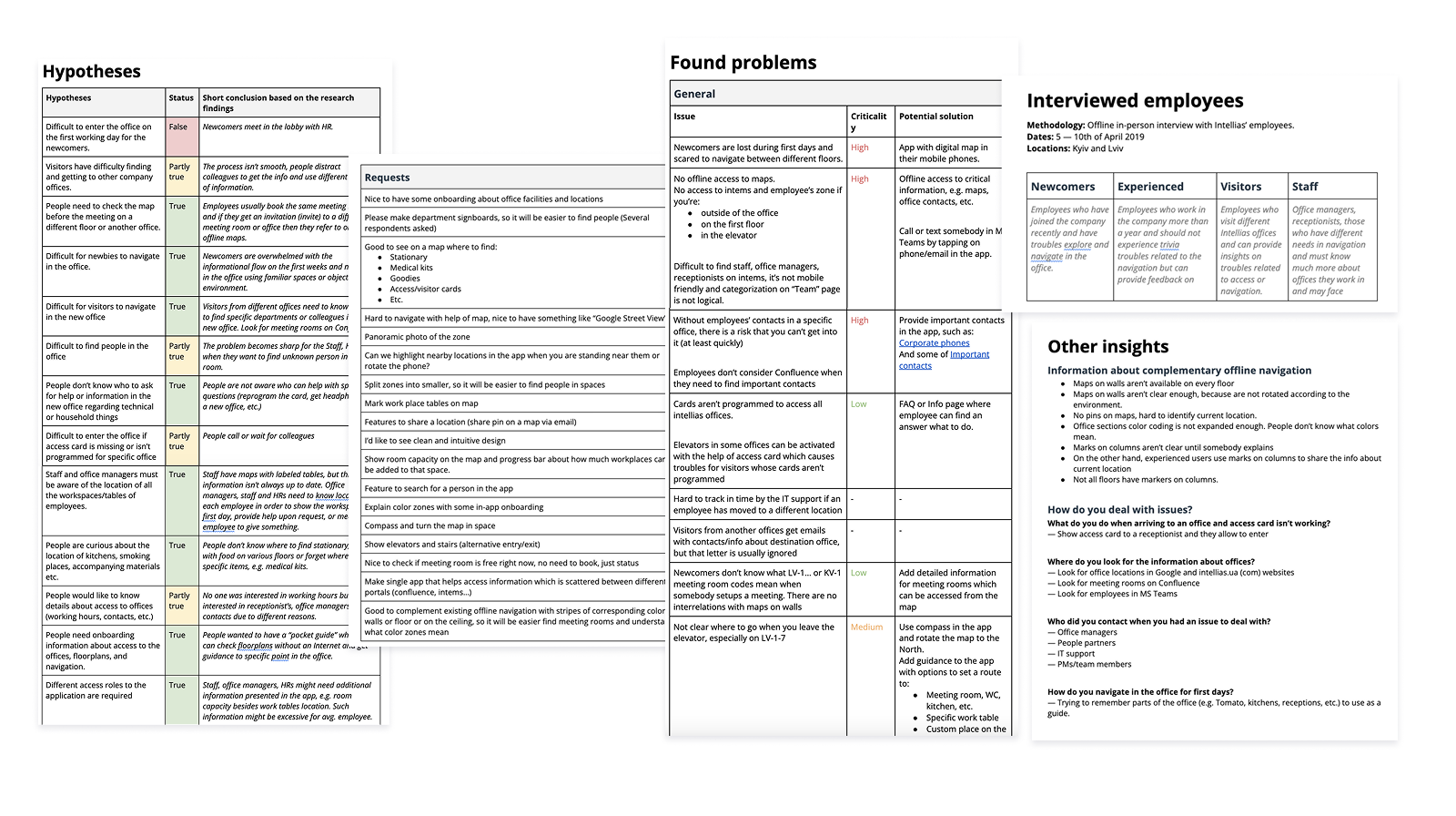
User interviews and testing showed that people struggled with orientation, especially when maps didn't match their current position or mental model of the space.
Printed maps were particularly ineffective:
The core issue was clear — navigation systems didn't align with how people actually understand and move through space.
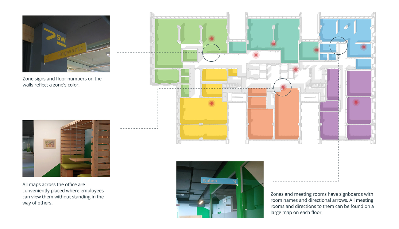
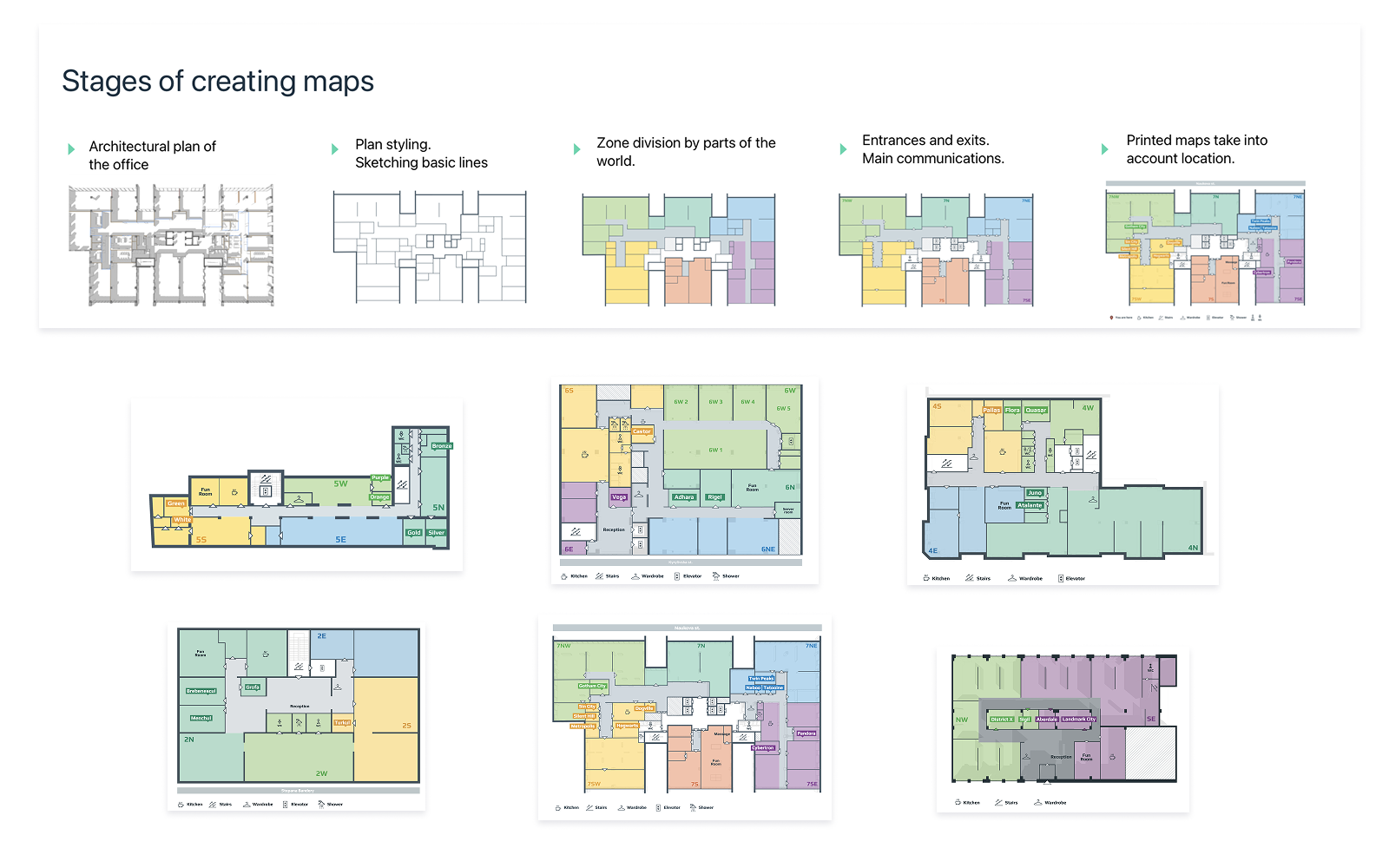
To improve navigation, we introduced a consistent wayfinding system across all office locations.
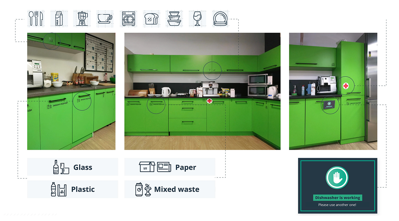
The space was divided into zones ("parts of the world"), each with its own color and visual identity. This system was applied across maps, signage, and interior elements, helping users quickly understand where they are and where to go.
Icons and color coding were used to simplify recognition of different room types and facilities.
Instead of relying only on digital prototypes, we tested solutions directly in the office.
Alternative map versions were placed on walls, and users were asked to complete real navigation tasks.
This revealed that orientation depends heavily on context — maps needed to reflect the user's actual position, not just a fixed "north-up" view.
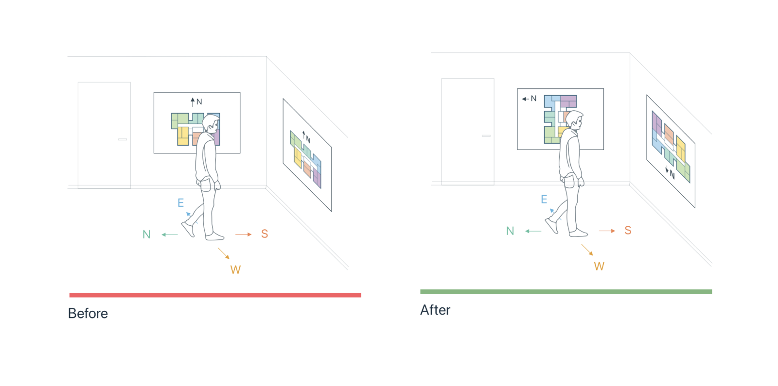
Based on testing, we redesigned maps to match how people move through space.
Different map orientations were introduced depending on their placement, aligning with the user's point of view.
This significantly reduced confusion and made maps easier to use in real scenarios.
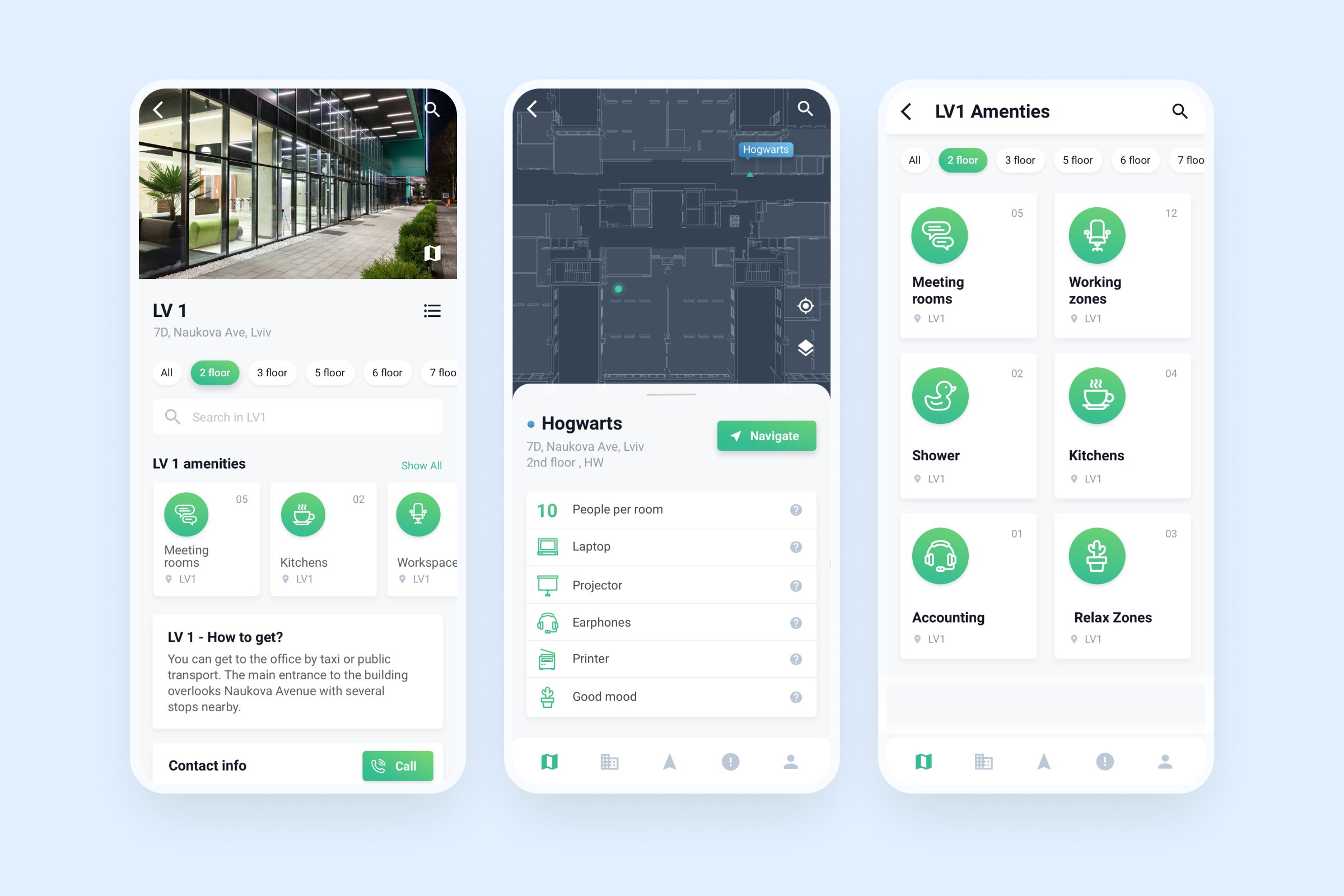
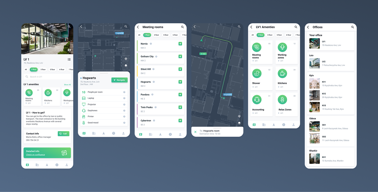
Alongside physical navigation, we explored a mobile application as a primary navigation tool.
The concept was based on Bluetooth beacons, enabling real-time indoor positioning and contextual guidance inside the office.
The app was designed to:
It could help users navigate spaces in real time, find colleagues, and move through the office with confidence — extending navigation beyond static maps into a dynamic, context-aware experience.
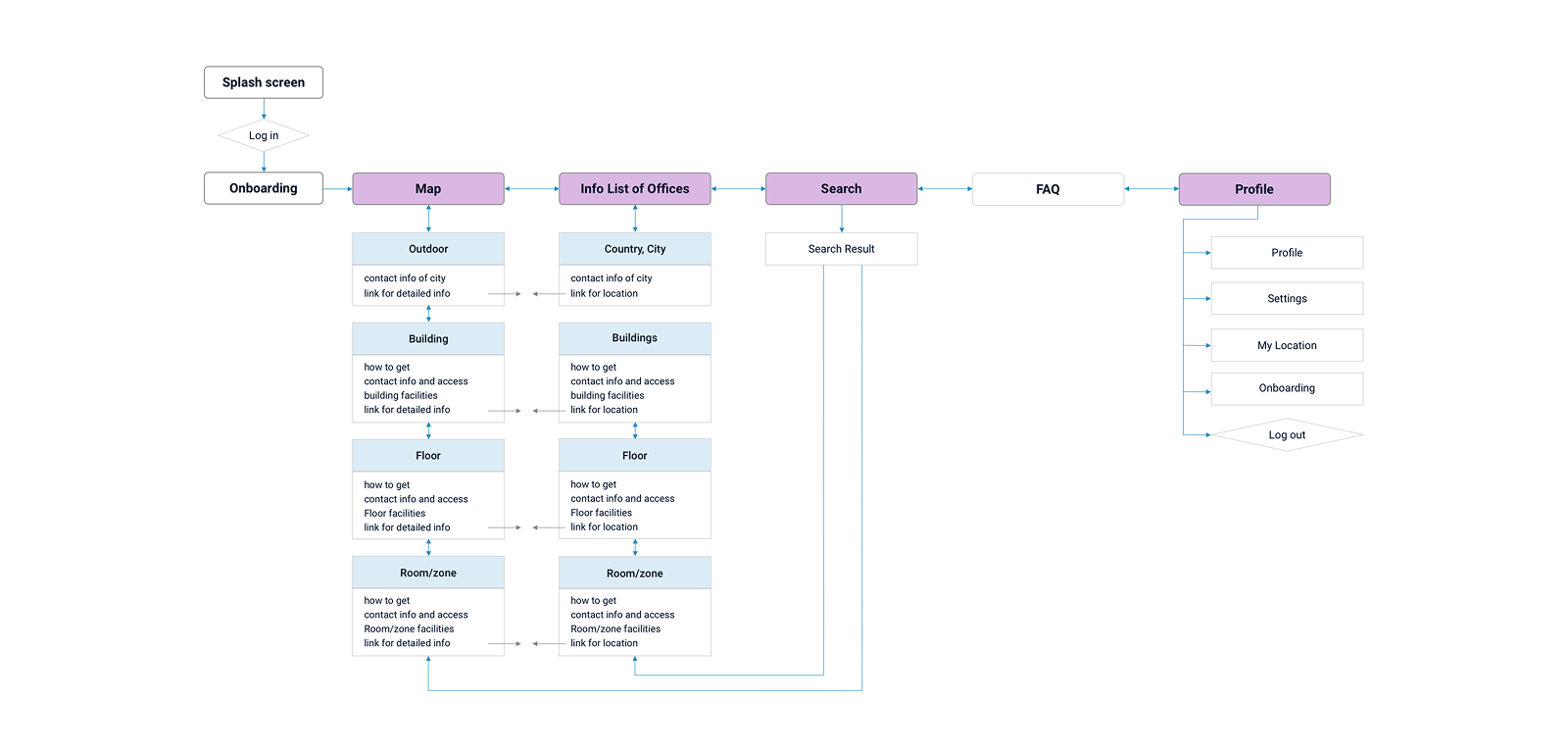
The result was a unified navigation system combining physical and digital layers.
Maps, signage, and mobile concepts were aligned under one logic, improving orientation across office locations and reducing friction in everyday navigation.