The client had developed software for facility capital planning — supporting strategic decisions around buildings, maintenance, and long-term infrastructure investment. Over time, it had expanded into four independently evolving cloud modules, each addressing specific client needs.
As a result, the system functioned as four separate products rather than one platform. Customers often used multiple modules in parallel, but there was no consistency in UI patterns, navigation structure, or terminology. Adding new features became increasingly complex without affecting existing workflows, which were deeply embedded in users' daily routines.
The core challenge was not visual alignment alone, but structural unification: how to merge four products into one cohesive system without disrupting established user behavior.
Before product design, I trained as an architect (Master's in Planning). That background turned out to matter on this project more than on any other in my career.
Reading building plans, understanding how facilities are actually maintained, and being able to talk fluently about BIM data and floor layouts meant I could understand the business underneath the software — not just the UI on top. I could review BIM/ArchiCAD outputs without translation. And when designing the indoor 3D navigation, I understood spatially what users were trying to accomplish before they explained it.
That domain literacy shaped every decision in the project — and made the four-product consolidation work far less abstract than it would have been otherwise.
The first phase was a deep competitor analysis across seven competing platforms. This was 2021 — there was no AI to summarize transcripts, cluster patterns, or auto-generate comparisons. Two months of structured manual work.
The analysis surfaced clear strengths and gaps in the client's product compared to the market — and informed the strategic direction for the consolidation. It also gave me concrete patterns to draw from when redesigning specific features.
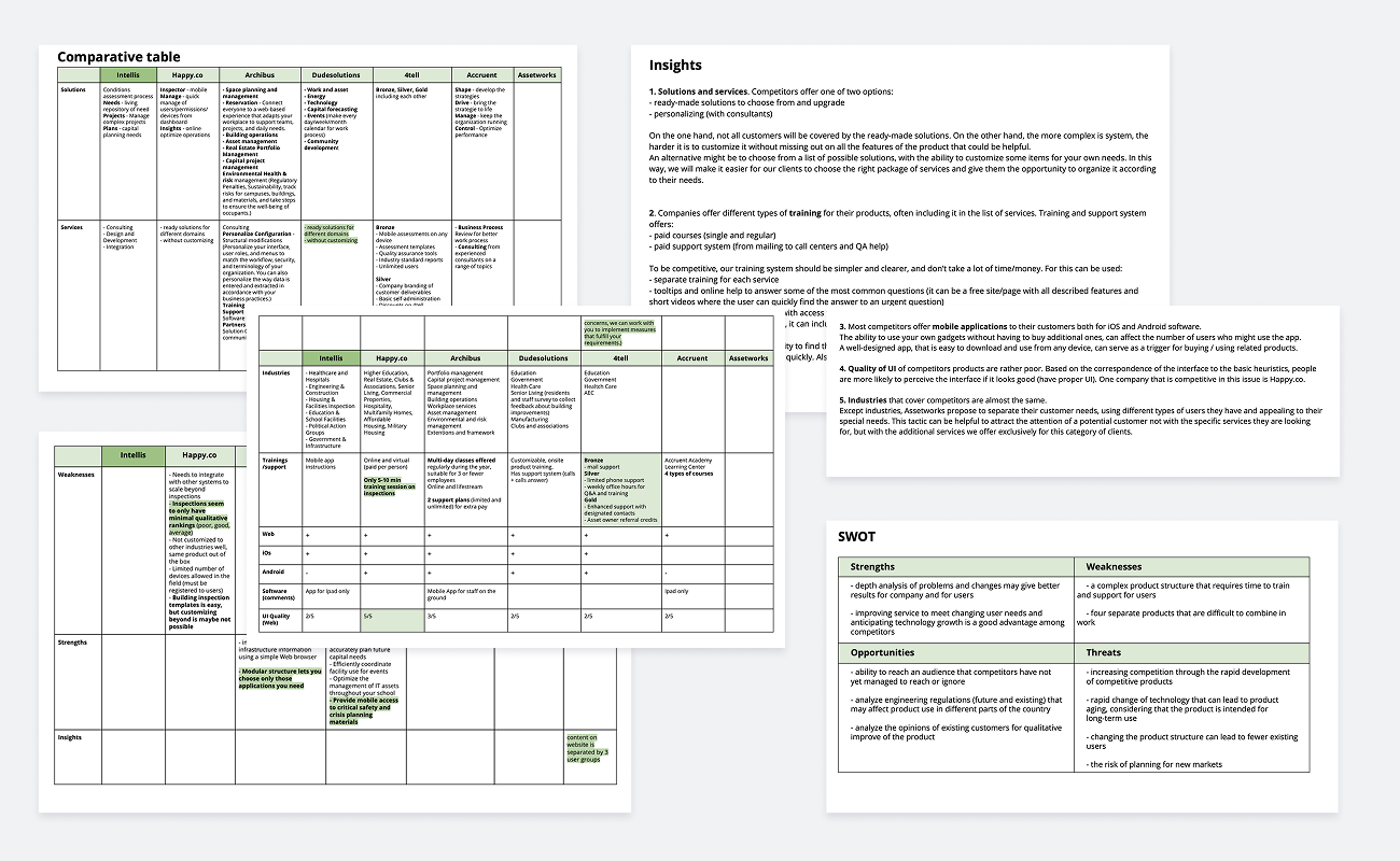
A documented competitive landscape — used to inform feature prioritization, IA decisions, and the consolidation strategy. Today, this kind of work would take week instead of months — but the depth of understanding it gave me still shapes how I approach competitor research now, with AI in the loop.
The four products served different roles inside the same enterprise client organizations — facility managers, inspectors, capital planners, executives, back-office teams, and more. Six personas in total, each with distinct workflows but overlapping touchpoints.
I mapped:
This was the foundation everything else rested on. Without clarity on which persona owned which part of the system, the consolidation would have been impossible.
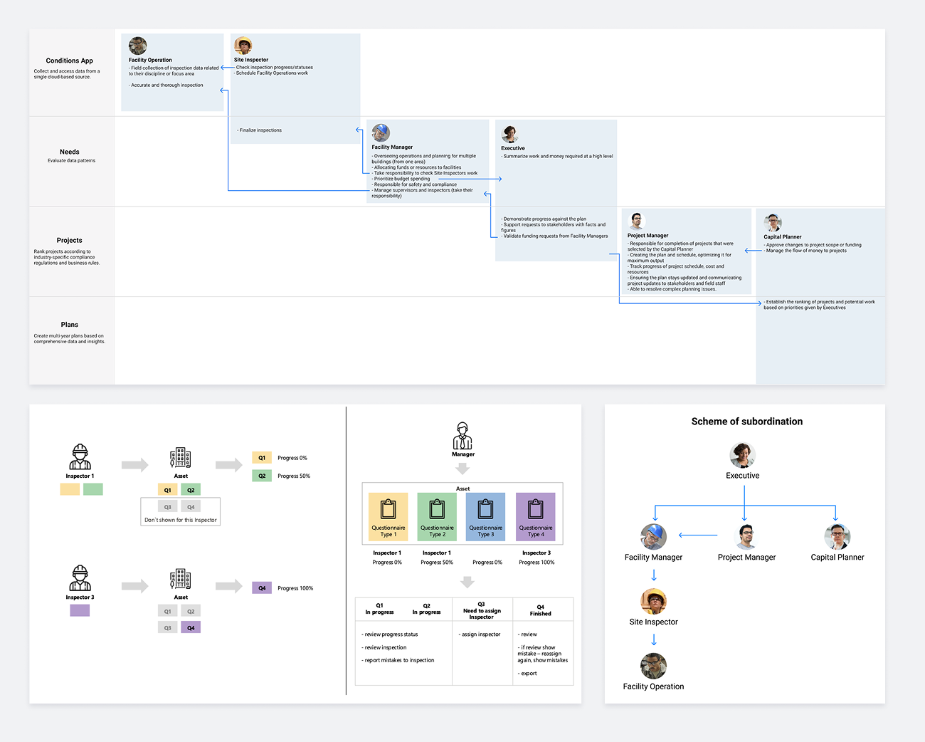
A unified persona and journey model that defined the spheres of responsibility across the four modules — the basis for every IA, feature, and structural decision that followed.
Before any UI work, the four modules needed to be understood as one system. I built two connected artifacts: a low-fidelity IA structure for the first module, and a functional decomposition diagram (FDD) covering the entire product across all four modules.
The IA work made the underlying logic visible — color-coded by persona responsibility, it gave the client and the development team a bird's-eye view of who interacted with what, and where the structural weak points were.
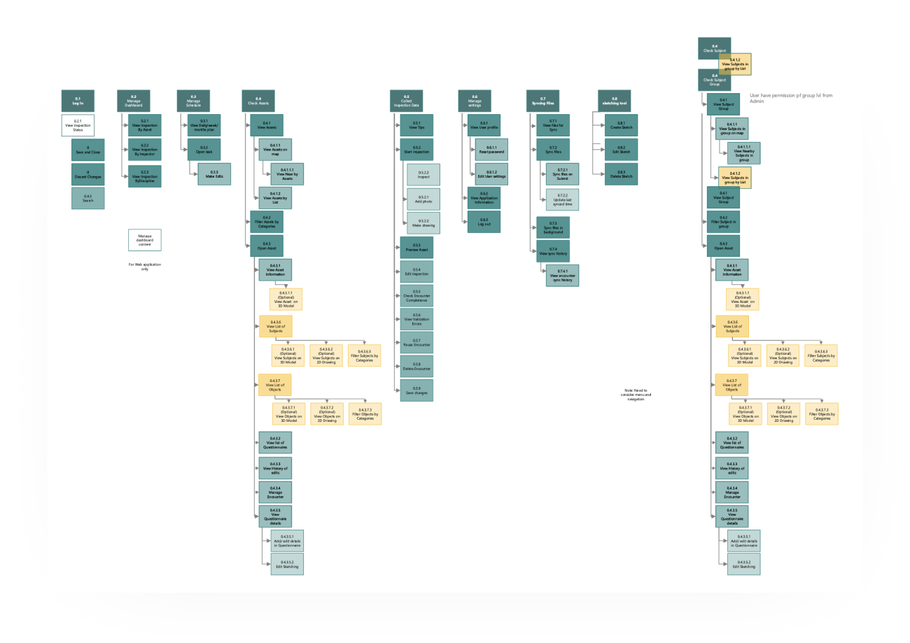
The FDD went deeper. Every feature, every sub-task, every system-user relationship across all four modules — mapped out in a 40+ page document. It took roughly half the project timeline to build. Painful work, but it became the document the entire team — design, product, engineering — referenced for the rest of the project.
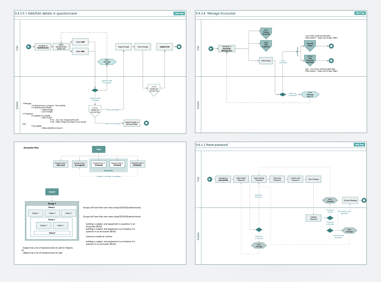
Together, the two artifacts allowed the team to:
A shared structural language between design and engineering — and a single source of truth for product structure that survived me leaving the project. The client used the FDD as a planning artifact for new features long after.
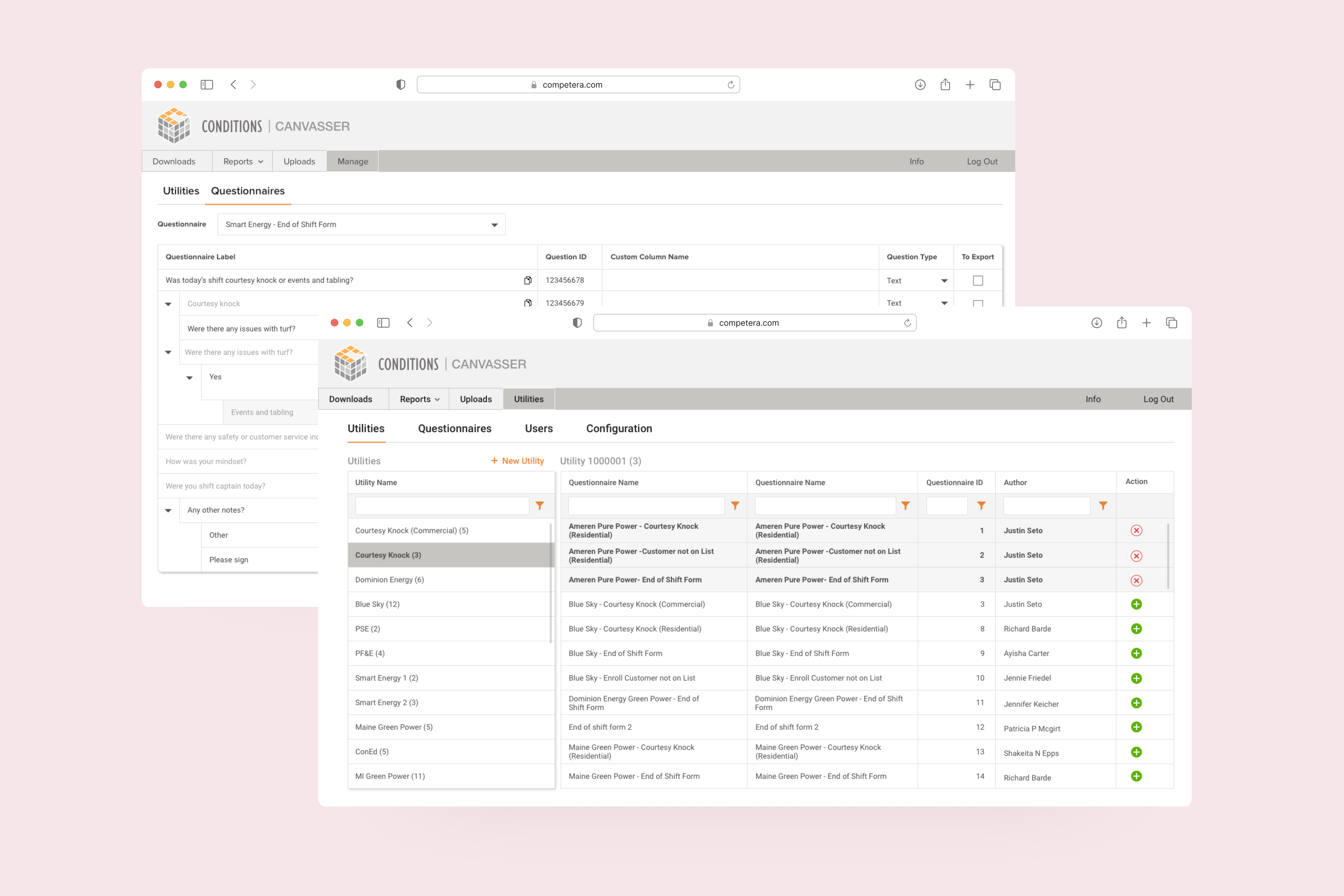
The main web product had grown for years without a designer. Every new feature added more density, more nested settings, and more places where users had to remember "the old way" of doing something.
I led the redesign of the web product — restructuring navigation, simplifying feature placement, and rebuilding the UI on top of an existing component library adapted to the project's needs.
The constraint was strict: existing clients couldn't be disrupted. Some had built their internal training, documentation, and operational habits around the old version over years. Changes had to be carefully phased, with familiar patterns preserved where possible and improvements introduced gradually.
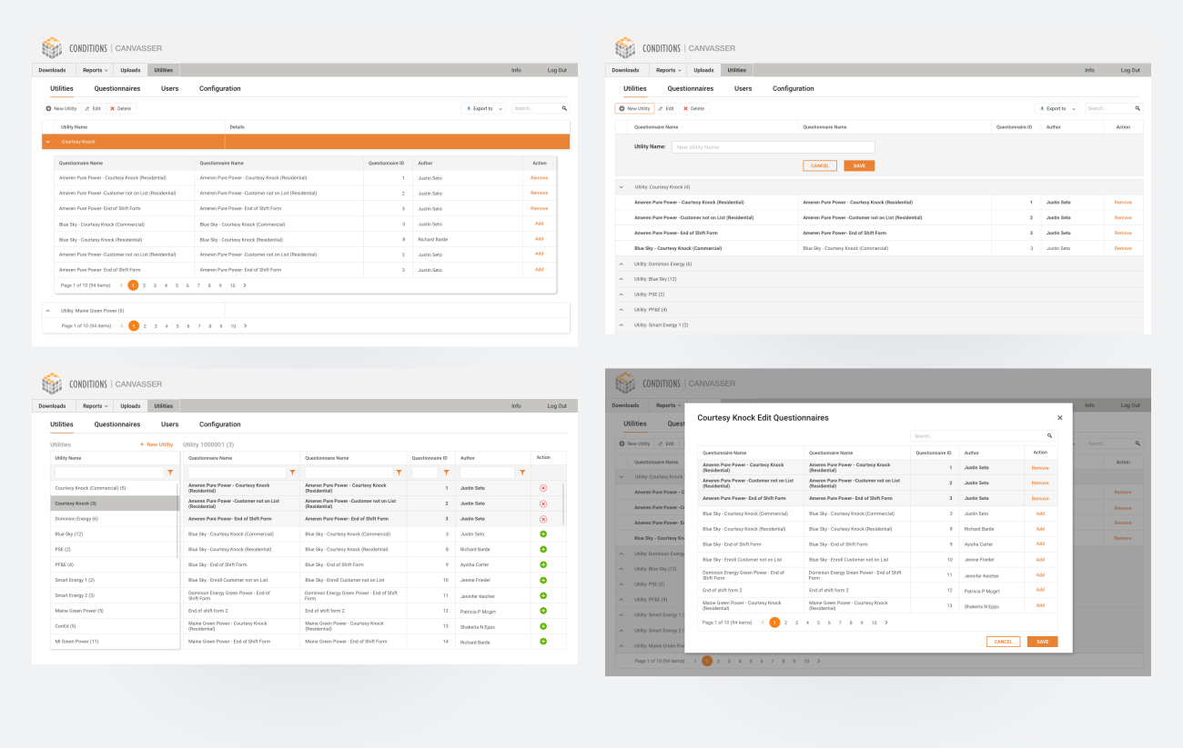
A cleaner, more navigable web product that supported new features without alienating long-standing clients. The redesign shipped to production and was used across the client's full customer base.
The iPad app was the field tool — used by site inspectors to walk through buildings and complete structured inspection reports. The core workflow involved a questionnaire of 200+ questions, often broken across multiple visits, multiple inspectors, and multiple buildings.
Three pieces of work shipped:
Inspectors regularly needed to leave questions unresolved and return to them later — sometimes the next day, sometimes after consulting a colleague. The original flow made this painful. I redesigned the navigation so unresolved questions were easy to find, return to, and complete out of order — without losing context for what had already been filled in.
Inspectors needed to mark up building plans directly — circling damaged areas, annotating maintenance needs, drawing routes. I improved the painting/annotation feature for Apple Pencil, making it precise enough for technical work without losing the speed needed during a real on-site inspection.
The most ambitious piece — a 3D walkthrough where users could navigate through a building using BIM data (likely from ArchiCAD), inspect structural elements, and mark facility conditions in spatial context. This was designed in full but launched after my time on the project.
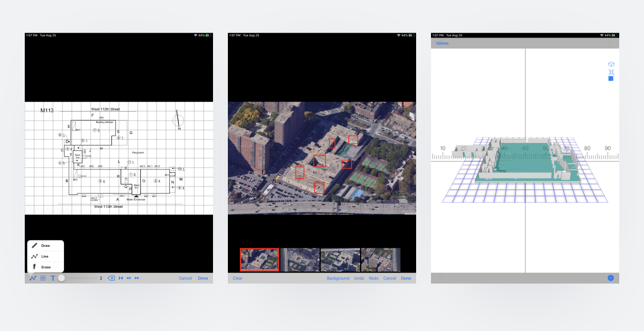
Two major iPad app improvements shipped to production. The painting and questionnaire updates went out as part of urgent fixes during the early COVID period — the client's hospital customers were using the app heavily, and the team delivered hot fixes that landed cleanly without breaking the existing workflow. The 3D indoor navigation was designed end-to-end and handed off for engineering build.
The early COVID period turned out to be a real-world stress test. Healthcare clients — already users of the inspection app — were under enormous operational pressure. Hospitals were rapidly reconfiguring physical spaces for patient surge capacity, and the inspection workflow became suddenly mission-critical.
The team shipped a series of hot fixes during this period — small targeted improvements driven directly by client requests. Every fix landed cleanly. Existing clients across all sectors absorbed the changes without complaints, and several hospital clients gave specific positive feedback.
A trusted product during a high-stakes period, with multiple successful hot fixes delivered without disrupting the wider customer base.
Document the FDD as a living artifact, not a deliverable. I treated the 40+ page functional decomposition as a one-time output. In reality, it kept getting referenced and updated long after I shipped it. Building it as a living, versioned document from day one would have saved later maintenance and made handoff to the next designer cleaner.
Push for measurement on the iPad app. I have qualitative signals (clean rollouts, positive client feedback, contract renewal) but no hard usage numbers. Even basic analytics on questionnaire completion time, return-to-question frequency, or 3D view engagement would have made the design wins much more defensible — and would have informed the next round of improvements.
Validate the indoor 3D navigation with real inspectors before going deep on visual design. I designed it confidently because I understood the spatial logic from my architecture background. But the people who'd actually use it daily had different mental models, and earlier user testing with real inspectors would have surfaced edge cases I only learned about later.